AWARE
AWARE helps people live independent lives, from birth through adulthood. Founded in 1976 as a nonprofit corporation, AWARE delivers services for children and families as well as people with challenging mental health, emotional, and in some instances, physical disabilities.
I chose wings to show the uplifting and freeing nature of the organization. The idea of soaring above adversity influenced the wing, creating an onward and upward brand. Gold represents victory and triumph, as well as encouragement and hope.
HOMECARE MONTANA
HomeCare Montana is a nonprofit corporation which has a charitable purpose to advance the quality of home care in the state of Montana. This corporation operates strictly (and proudly) within the boundaries of the state, so it was important that the logo uses the Montana outline to show the importance of their region. I created this to work along with a minimal word mark.
The negative space plays with the outline to make a state outline into a recognizable mark. The simple green and silver represent the lush and vibrant life that HomeCare Montana has to offer it’s clients, while maintaining a high level of care and respect.
MERKABAH LABS
Merkabah Labs is a Colorado based agricultural hemp company providing various CBD products. Their mission is to provide the world with a natural, self-care option that lights up the spirit and rejuvenates the body.
The logo is the Cannabidiol molecule with the “M” of the previous logo, paying homage to their old mark and modifying the look from mystical to scientific. The calming blue and greys represent the nature of their CBD products: reliable, quality, and here to soothe what ails you. This typography was chosen in particular to convey the modern and minimal style of the Merkabah Labs brand.
WAVJUNCTION REJECTS
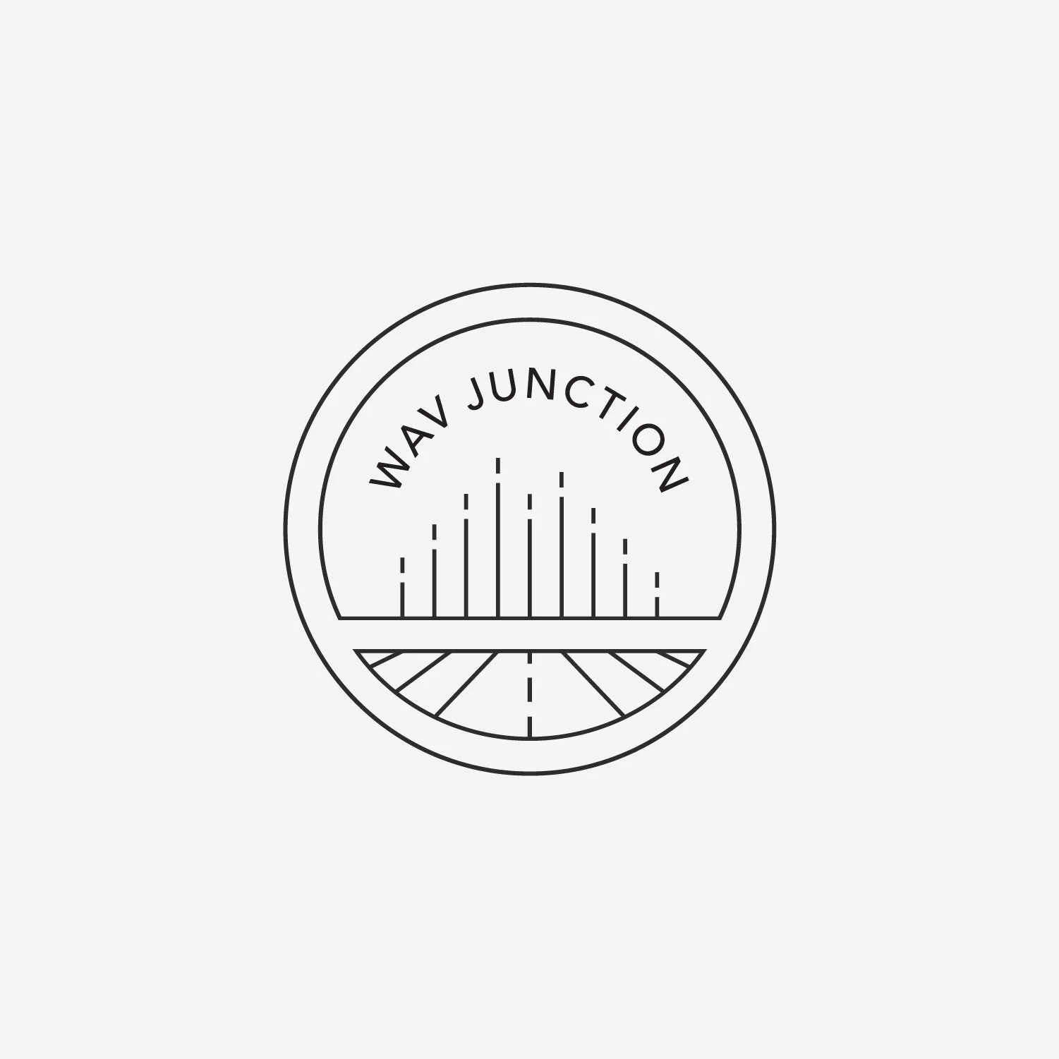
While creating the WAVJunction logo, there were, as always when creating logos, a few casualties. Continuing the theme of using a sound wave, these variations focus on a stamp-like seal and a stylized, bordered word mark. Keeping the design minimal, the sleek contained marks would compliment the modern brand while emphasizing the quality of the products.


